 Tweet
Tweet
On Microsoft's moneycentral web site,
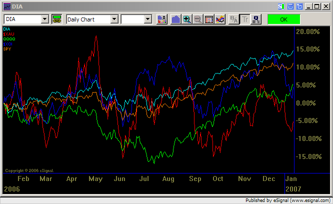
I can create a relative performance chart
of many symbols such as the following
chart. Note that on the left hand side,
they all start with 0% and if I change the
display period, say from 1 year to 2 year,
the 2 year chart will start with 0% on the
left hand side again.
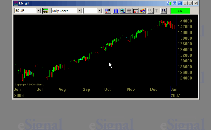
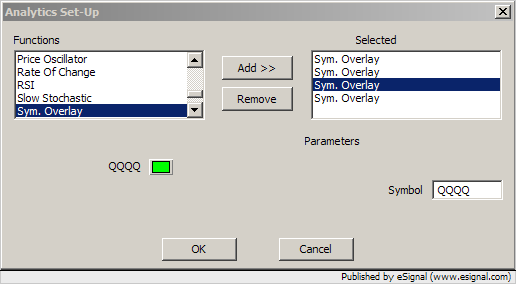
I know eSignal has symbol overlay feature. But it is not the same.
Is there any way to create a chart
like this ?

I can create a relative performance chart
of many symbols such as the following
chart. Note that on the left hand side,
they all start with 0% and if I change the
display period, say from 1 year to 2 year,
the 2 year chart will start with 0% on the
left hand side again.
I know eSignal has symbol overlay feature. But it is not the same.
Is there any way to create a chart
like this ?
Comment