 Tweet
Tweet
This thread is for users of the Advanced GET Dashboard to share different methods to use the Dashboard to locate trading opportunities.
-
Nate McCartney -
Trading with a Higher Power
For starters, I'll show how I like to use the Stochastic with the False Bar to find the best trends to trade.
I like to find a security wherein a high time frame, such as the 60 minute or Daily, shows that we are trending. For those of you unfamiliar with the False Bar Stochastic, see picture B.
In the Dashboard, a WHITE outline indicates if a particular time frame has a False Bar present or not. A GREEN dashboard indicated the market is set up for a Stochastic BUY (where the two stochastic lines are at the bottom of the Stochastic study), and, conversely, a RED dashboard indicates that the lines are at the top, setting up for a Stochastic SELL opportunity.
In picture A, the Dashboard is showing that the 60 minute chart has a False Bar on the Down side, indicating that the market is TRENDING DOWN on the 60 minute time frame. However, the 15 minute time frame is set up for a Stochastic SELL with NO FALSE BAR. This shows that the higher time frame is controlling the trend, and opportunities to jump INTO the trend may exist on the shorter time frames.
Picture B shows the 60 minute time frame with the False Bar in place.
Picture C Shows the trade setup on the 15 minute chart. The Stochastic lines are above the 75 line of the stochastic, with NO FALSE BAR, indicating a good selling opportunity on this time frame.
Picture D shows that opportunities existed on the 5 minute time frame as well, for those of you that like to trade the shorter time frames. At the time of the arrows, the 5 minute cell on the dashboard would have indicated a selling opportunity.


 Last edited by Nate McCartney; 09-01-2005, 11:10 AM.Nate McCartney
 -
Daytrading with the Dashboard
One of my favorite GET Trading Strategies uses the XTL. The majority of my trades are trend based so I like to see markets that are trending in a certain direction and try to jump in at the retracements.
By monitoring the Dashboard I can easily see that the FOREX markets I trade are non-trending as the day trading timeframes (5,15, and 60) are all yellow. For now I can take my eyes off the Forex markets.
I also trade the E-Mini S&P and see that we are in a strong uptrend by the Green color in the dashboard. (GREEN is Up, RED is Down)I can simply pull up the chart by double-clicking in the dashboard and look for long opportunities in the direction of the trend.
And the best part is I can monitor all these markets on one screen
 Ron Wheeler
eSignal LearningComment
-
Dashboard and XTL relationship
I have been a XTL trader for 7 years.This dashbord appears promising
I would like to know the relationship between the dashboard indicator and XTL ?
Secondly I am a 30 minute chart interval trader .Can I set up 5,15 and 30 minute, daily dashboard for stocks I followComment
-
Re: Dashboard and XTL relationship
All the dashboard does is show you what the current condition of the XTL Study is in.When the dashboard is GREEN the XTL is BLUE/Up Trend, when the Dash is RED the XTL is RED/Down Trend, YELLOW is black (No Trend). The purpose is to simplify your analysis, instead of checking 100 charts you can monitor the dashboard.Originally posted by rparti
I have been a XTL trader for 7 years.This dashbord appears promising
I would like to know the relationship between the dashboard indicator and XTL ?
Secondly I am a 30 minute chart interval trader .Can I set up 5,15 and 30 minute, daily dashboard for stocks I follow
The dashboard can display any symbol on the 5, 15, 60, D, W timeframes.Ron Wheeler
eSignal LearningComment
-
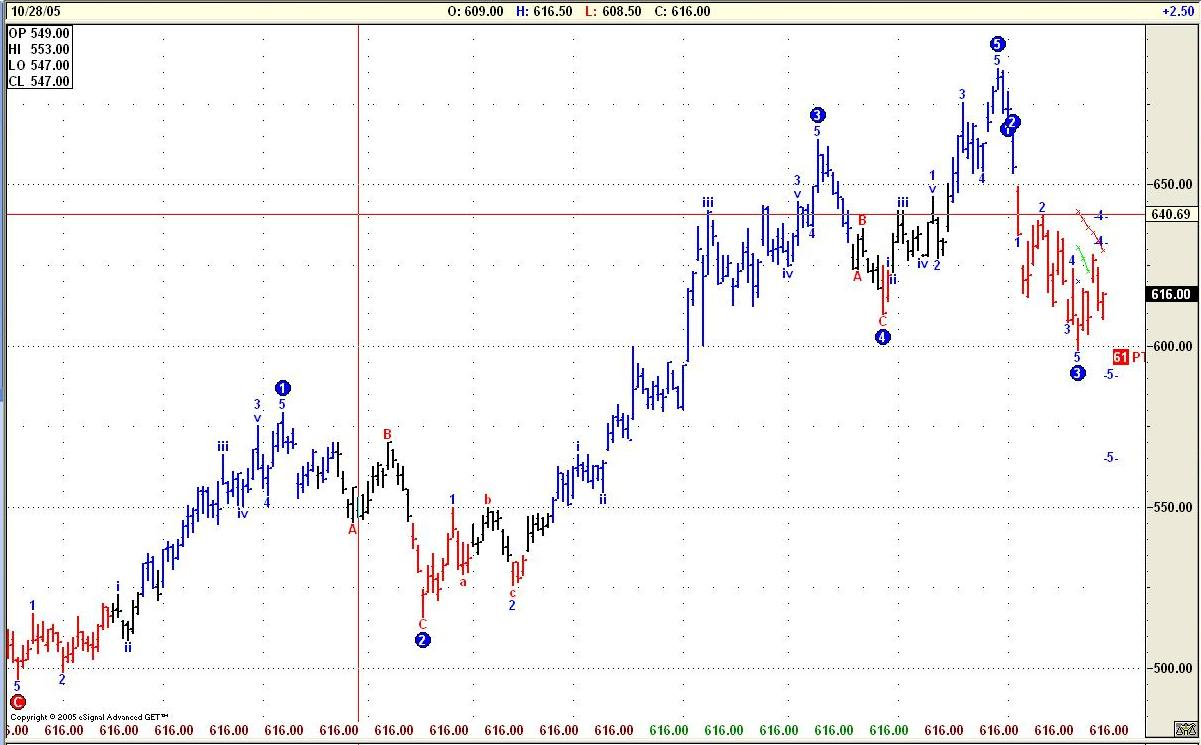
Elliot wave count
Most Dashboard users are familiar with adding Elliot waves just with the click of a button. But every now and again I get an Elliot wave count I do not like the look of, Such as the following:
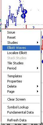
I wish to see a longer time frame on the Elliot count. So right click on the chart and go down to Elliot Waves:
Then click:
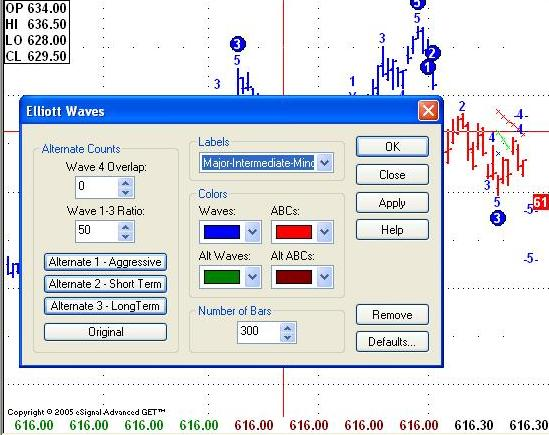
Now I have a choice, here I have gone for long term waves, and as if by magic.:
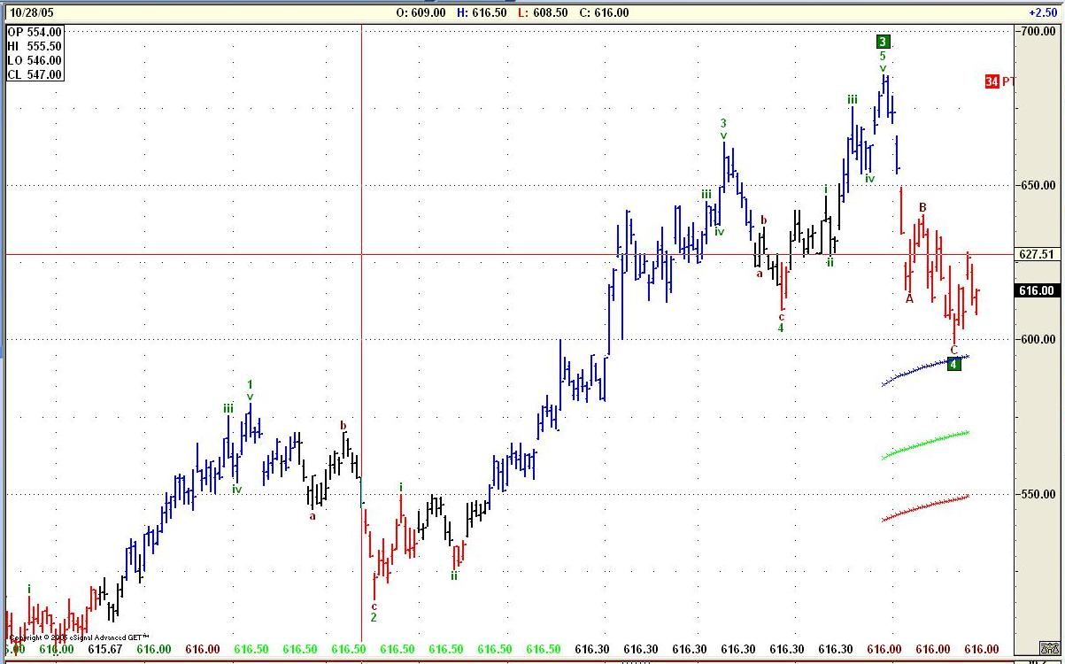
A chart that I am now willing to trade from.Last edited by Andy S; 10-28-2005, 02:24 PM.Happy Trading
Andy SaundersComment
-
Recent Dash Example
This example from the dashboard showed up when Ernest and I were doing a recent sales seminar in Houston. We scanned the market for stocks setting up as Stochastic buys on the 60 minute time frame, while the Daily time frame had the stochastic in SELL mode. What we were hoping for was to catch a higher time frame in an UP trend (the daily), while the lower time frame (the 60) gave us a classic buy.
The dashboard (which I cannot capture now, since it has changed from last week) had RED for both the Daily and Weekly, but had a white boarder, indicating a False Bar on the top of each stochastic. That means that the Daily and the Weekly were trending up, shown in the charts below. The 60 minute was GREEN, indicating a classic stochastic buy.
AAPL was the first one on the list, and the one I'd like to share with you in the charts below:


 Nate McCartney
Comment
Comment