Announcement

Collapse
No announcement yet.

Chart Appearance - revisited

Collapse
X
 
  • Filter
  • Time
  • Show
Clear All
new posts

  • Chart Appearance - revisited

    Hello,

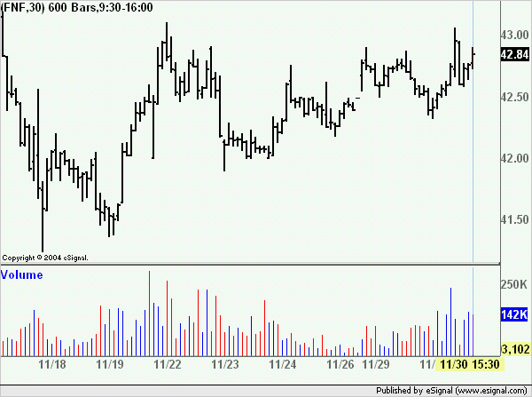
    Can someone please take a look at the attached image of the chart for FNF. The interval is 30mins. I would like to know if you get the same view of the chart. It is virtually impossible to see what is going on.

    I have tried

    Thanks

    Carlton
    Attached Files

  • #2
    Carlton
    Right click the chart and select Scaling->Scale Price Data Only and see if that resolves the issue
    Alex

    Comment


    • #3
      Alex,

      Thanks for getting back to me. I did as you said, however I'm afraid that there is very little difference(please see image). I should however mention that the chart does appear ok when opened in the full window. It only appears compressed when I cascade it with a number of charts. Is that normal?

      Out of interest, did you bring up the chart yourself. If so, did it appear compressed to you?

      Cheers.

      Carlton
      Attached Files

      Comment


      • #4
        Carlton
        This is how the chart appears at my end and it makes no difference if it is cascaded with other charts either on top or below.
        As an aside when you post images please post the whole chart rather than just a portion so that one can see the settings in the Study Title
        Alex

        Comment

        Working...
        X