Announcement

Collapse
No announcement yet.

volume for the NYSE

Collapse
X
 
  • Filter
  • Time
  • Show
Clear All
new posts

  • volume for the NYSE

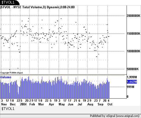
    I am posting a shot of a very useful screen shot of a TS volume chart for the NYSE. I know we can use the symbol $TVOL for this volume BUT I cant find a way to get a useful chart with it. The nice thing about the TS chart is the different colors - so that you can easily compare 2 different times of reference - like- today at 9:00am and yesterday at 9:00am. With out bracketing the different times of the day in different colors - it makes it very difficult to easily see the comparisons.
    Any help with this will be greatly appreciated.
    gdavi68
    Attached Files

  • #2
    Hi GDAVIS01,

    I'm not a programmer by any means, so there may be others who can help with the bar coloring that you mentioned. However, I did come up with a little tweak that may work for you. As it currently stands, the daily chart for $TVOL looks something like this.


    Because the information in the price pane is being calculated from the close, a single line is drawn at the total volume value for any given day. Try this......

    Start by adding a volume study to the chart. Next, right-click on the Advanced Chart window and choose Edit Studies. Change the color of the candle or bar to match the background color of the Advanced Chart. In this case, I changed both the Candle Outline and the Wick Color to white, the same as the chart background. By doing this, the data basically disappears.


    Once closing values are no longer visible, use the SHIFT and Drag method to overlay the volume study into the Price pane. You should end up with a chart that you can begin working with. You may want to increase the vertical scaling so that the bars are exaggerated and closer to what you were displaying with TS

    Comment


    • #3
      Thanks Duane,
      I tried your suggestion - and there is a problem. I cant get the bars to show intraday data. The bars all max out to the top.

      What i'm trying to achieve is an intraday comparison - so that at 9:00 AM I can look and see how we are faring today versus yesterday or 2 days ago. (or whatever)

      I need to be able to bracket the different periods of the day and look and say "much more volume than the last 3 days - mabey I'll get better follow-thru on the swings".

      That gives me an edge to either want to hold a trade for a better play OR take a very quick scalp.

      Thanks,
      gdavi68

      Comment


      • #4
        gdavi68,

        Thanks for the info. I definitely see where you are going with this, but I'm sure how to go about it. The trick in this process is to work with an EFS that recalls the corresponding data, ..."the same time a week ago compared to current data" or "X" many days ago and then noting the differences.

        In regards to the intraday data, we basically want to disregard the volume study that I mentioned in my previous post and rely more on the price data itself. In the case of intraday data, the value can only increase as volume is added throughout the day. As the volume study was useful when reviewing total daily volume, it is of little use in an intraday timeframe.

        If I come across anything that helps with this, I'll reply back to the thread.

        Comment


        • #5
          GDAVIS01,

          I have been doing something similar to this, but without the colored segments which depend on time of day. Your TS chart looked useful, so I thought I would try to to it. Alex has been so kind as to help me with some other time related efs and I borrowed heavily from what he has taught me. (Thanks Alex).

          So here is an efs which will do what the TS indicator does, at least very close. A few caveats, however. I did not spend a lot of time trying to productize it so it is idiot proof and may not work in all cases.

          This efs is for use on $TVOLQ and $TVOL.
          It allows the user to choose several time periods during the day and color the volume bars differently for each period.
          This gives the ability to look at volume at any given time in the day and compare visually to previous days' volume in that time period

          * time is 24 hour time
          * set up to work on 10 min chart, but will work on other time periods as long as they are intraday, may need adjustments
          * works best with RTH time template
          * if used on time templates other than RTH may have to adjust times and some other stuff, for a 24 hour chart you probably have to modify it a bit.
          * you can set 7 different time periods to color
          * defaults are for Central Time zone
          * times can be set from Edit Studies, but to change colors you have to go into the efs to modify
          * if the time period you choose does end or begin on the end or begining of a bar on the period of the chart, some colors will not display. I.e if you set the first time period to last the first 30 min, you will not see a color change at that point if you are on a 60 min chart.

          I use it with a candle chart because the bars are wider, but it will work with a line chart as well. Put it on the chart, then play with the chart style (line or candle), the bar width and the bar spacing to get it set up the way you want.

          give it a try.

          bigtee
          Attached Files

          Comment


          • #6
            Bigtee,
            this is exactly what I am looking for
            this is fantastic
            Thank you
            gdavi68

            Comment


            • #7
              Great!
              If you improve it, please post it back.

              bigtee

              Comment


              • #8
                bigtee,

                Thanks for taking the time to share this with the community; very nice study indeed...

                Comment

                Working...
                X