We are building an efs that displays the red dots in the chart (Chart #1) below by using the following code technique.
This code sets the red dots when triggered by the EFS to show up 2 points above the bars high. Notice how the dots don't smoothly align like they do for the "Parabolic.efs" shown in Chart #2?
We also don't want them to be set by a point ratio if possable for this does'nt appear right for securities..
Our 1st question would be ... How to set the code so the red dots would align in a smoother conjunction like they do in the parabolic.efs chart? (Chart #2)
Chart #1:

Chart #2:

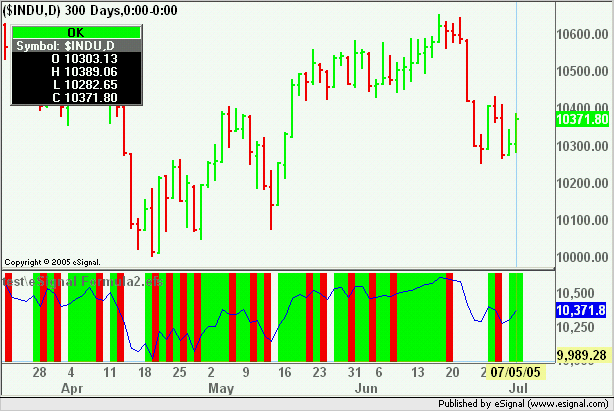
Our second question is..... The lines (Green & Red) shown in the non-price study window in chart #3. We have the code set to a trigger which initiates the color line to appear, but instead of just having it appear for that "bar" we want it to fill continuously until
the counter trigger is initiated. (just like Buy & Sell triggers)
The colors would appear like they do in our un-professional drawn chart #4. Thus filling in the white spaces where the color should continue until the reverse trigger is initiated.
Chart #3

Chart #4

Any help would be appreciated.
PHP Code:
drawShapeRelative(0, high()+2, Shape.CIRCLE, "", Color.RGB(0,128,0), Shape.BOTTOM);
We also don't want them to be set by a point ratio if possable for this does'nt appear right for securities..
Our 1st question would be ... How to set the code so the red dots would align in a smoother conjunction like they do in the parabolic.efs chart? (Chart #2)
Chart #1:

Chart #2:

Our second question is..... The lines (Green & Red) shown in the non-price study window in chart #3. We have the code set to a trigger which initiates the color line to appear, but instead of just having it appear for that "bar" we want it to fill continuously until
the counter trigger is initiated. (just like Buy & Sell triggers)
The colors would appear like they do in our un-professional drawn chart #4. Thus filling in the white spaces where the color should continue until the reverse trigger is initiated.
Chart #3

Chart #4

Any help would be appreciated.


Comment