Announcement

Collapse
No announcement yet.

Yet another advanced chart symbol overlay question...

Collapse
X
 
  • Filter
  • Time
  • Show
Clear All
new posts

  • Yet another advanced chart symbol overlay question...

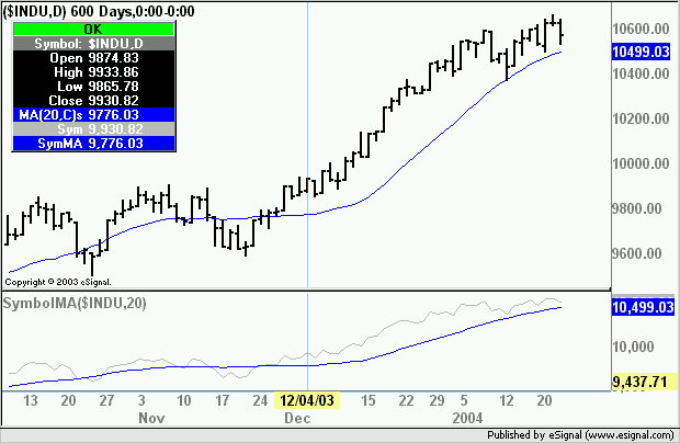
    I am enjoying the multiple symbol ability of eSignal 7.5, but I have a question.

    When you plot two symbols, eSignal automatically creates an additional scale. This is usually necessary because the two symbols have a price action in different ranges. For instance, if I plotted $INDU as a second symbol to DELL, another scale would be needed because the value of $INDU is around 10500, and the value of DELL is around 35.

    OK, but what if I want to plot $INDU and YM H4 (the futures contract of INDU). Since these two symbols are going to be very similar in value, I would like to plot them on the same scale with the same scaling. I would like to do this so I could see a graphical representation of the spread between the two; I want to be able to look at the chart and instantly know whether the futures are higher or lower than the cash--if the ym line crosses over $indu, then I know that the future is trading higher than the cash, and conversely, if ym h4 crosses below $INDU, then I know-- instantly -- that the futures are trading lower than cash.

    However, when I plot these two symbols on an advanced chart, since they are on two different scales, there is no way to get them to "line-up" properly. The Y-axis for each symbol has a different offset. In addition, the offset can't easily be lined-up because the scaling interval may be different, i.e. one symbol might be plotted at a 5 point interval (on the y-axis grid), and the other may be plotted at a 10 point interval (on the y-axis grid). Obviously, this makes it impossible to do what I want to do.

    Question(s):

    1. Is there anyway to plot these two symbols so they have ONE fixed scale both in offset and in scale interval?

    2. If the answer is NO to #1, would it be possible to write an EFS to plot these two symbols in such a way?

    Thanks for your help!!!
    Parker

  • #2
    Re: Reply to post 'Yet another advanced chart symbol overlay question...'

    Dont know if this will help but, did you try plotting $indu - ym h4 as the
    symbol?

    Comment


    • #3
      Yes, that's the way I was doing it before 7.5. It is just that it takes to long to look at that chart, determine what the spread is at, make a determination as to its importance at that spread and then compare it to ES, which is what I am trading. It takes too long and I am late on trades.

      Thanks for the suggestion though!
      Parker

      Comment


      • #4
        I have another question.

        OK, even if you cannot plot two symbols on one fixed scale, is there anyway to shut off the price action of a symbol?

        In other words, lets say I wanted to plot a 10 period moving average of DELL, but I did not want the actual price of DELL itself to be plotted.

        I attempted to do this by changing the color of the price (whether it be a line, bar or candle), to the same color as the background of the chart, but the moving average line is UNDERNEATH the price line/candle/bar plotted line, so it becomes "spotty" as the price line/candle/bar is plotted over it in the background color of the chart (even though you can't actually see the line/candle/bar itself, but rather its "imprint".)

        I have attached a screenshot to illustrate what I mean. I have plotted a bar chart of $INDU and a 1-period moving average of YM H4. Since I can't actually remove the price line of YM H4, I changed the color of the line to be the same as the chart background. But now however, you can see "holes" in the other two plots (the $indu and the YM H4 1-period MA). This makes reading this chart hard on the eyes.

        I hope that eSignal could offer a color that is NO COLOR , in other words, transparent, but I don't think it is possible.

        Do you think a script could be written to just plot the MA or whatever other study one might night and NOT the actual price????
        Attached Files
        Last edited by PJVex; 01-22-2004, 11:47 PM.
        Parker

        Comment


        • #5
          Parker
          The attached efs will plot the MA of a symbol other than the one in the chart. Symbol and MA length are by default $INDU, 20 but can be changed through Edit Studies. Set the MA length to 1 as a proxy for the other symbol's price
          Alex
          Attached Files

          Comment


          • #6
            Alexis:

            Thanks for the script.

            I am trying a couple of different approaches in what I am trying to do. For starters, I want to try to plot the MA in a separate window. I tried changing setPriceStudy to (false), but I can' seem to get it to show up in a separate window.

            Any idea why this is not working????
            Parker

            Comment


            • #7
              Re: Reply to post 'Yet another advanced chart symbol overlay question...'

              When you make a change like this, just remove the study and readd it to the
              chart to invoke the change

              Comment


              • #8
                Parker
                The attached will plot a symbol - other than the one in the main chart - and its MA as an indicator in a separete window.
                Alex
                Attached Files

                Comment


                • #9
                  Alex: Again thank you for the scripts....one thing though is that the scripts seem to plot something slightly different than if I had used the built-in study....not sure if there some reason why it does this but just an observation.....

                  Also....is there anyway to turn off the auto scaling of an "additional symbol".

                  I guess I really enjoy the additional symbol capacity in eSignal, but the scaling of the two is driving me nuts....Lets say I have $INDU and $COMPQ up and $INDU is my main symbol. I can manually scale $INDU, either just moving the plot up or down or increasing or decreasing its interval....BUT I do not have this ability with $COMPQ, even if I try to "turn off" bothe the scaling and the scaling display of $INDU in Edit Studies.
                  Parker

                  Comment


                  • #10
                    Re: Reply to post 'Yet another advanced chart symbol overlay question...'

                    I believe if you scale the compx on the left axis you can control it from
                    there.

                    Comment


                    • #11
                      Re: Re: Reply to post 'Yet another advanced chart symbol overlay question...'

                      Originally posted by dloomis
                      I believe if you scale the compx on the left axis you can control it from
                      there.

                      It works, but then you can't shut it off.

                      Try it. Make $INDU your main symbol and $COMPQ as your additional symbol. Make $INDU as candles or bars, and $COMPQ as line so you can distinguish them easily.

                      First, adjust $INDU. You will see that it is easy, just like in eSIGNAL 7.4....you can move the whole plot either up or down, or expand or contract the interval.....everything is perfect. Now turn on $COMPQ scaling on the left side of the chart. You can pretty much do the same thing except that $INDU moves when you try to move $COMPQ and one must be very careful otherwise you will send the $INDU plot flying off the chart.

                      Next, try turning off the scaling and the scaling display of $COMPQ completely. IT CANNOT BE DONE!!

                      Do it and then try to move $INDU as you did before. It can't be moved independently....$compq moves all over the place. If you want to move $INDU independently as you did before, you actually have to REMOVE $COMPQ from the chart and re-add it.

                      This should be fixed by eSIGNAL.

                      Parker
                      Parker

                      Comment


                      • #12
                        Re: Reply to post 'Yet another advanced chart symbol overlay question...'

                        Now turn on $COMPQ scaling on the left side of the chart. You can pretty
                        much do the same thing except that $INDU moves when you try to move $COMPQ
                        You can adjust the indu until you futz with the compx, then the indu up
                        and down control seems lost.

                        when you try to move $COMPQ and one must be very careful otherwise you will
                        send the $INDU plot flying off the chart.
                        I agree

                        Next, try turning off the scaling and the scaling display of $COMPQ
                        completely. IT CANNOT BE DONE!!
                        I must be missing something, cuz if I turn on the left y axis, I can
                        move compx up and down and compress it with out affecting the indu.

                        Do it and then try to move $INDU as you did before. It can't be moved
                        independently
                        It can not be moved up and down but you can compres the right y axis.
                        But the comps stays put, here any way.

                        This should be fixed by eSIGNAL.
                        I agree.

                        Comment


                        • #13
                          Parker

                          ....one thing though is that the scripts seem to plot something slightly different than if I had used the built-in study....

                          Have you checked that the settings are the same? As far as I can see at this end the MA seems to replicate the builtin one. On some symbols there is an occasional 1/100th of a point difference that may be due to rounding.
                          Alex

                          Comment


                          • #14
                            Originally posted by Alexis C. Montenegro

                            Have you checked that the settings are the same? As far as I can see at this end the MA seems to replicate the builtin one. On some symbols there is an occasional 1/100th of a point difference that may be due to rounding.
                            Alex
                            Alex: Here are two screenshots:

                            For the first one below, I set YM H4 as the main symbol (displayed as a light blue line--which frankly I wish I could turn off!), and then using the builtin study, I create a 1-period MA and display it as a blue dashed line. Then I set the second symbol to $INDU and display it as red and green bars).

                            In the next screenshot, I have $INDU as my main symbol, displayed as red and green bars. Then I use the formula you suggested--"SymbolMA". I go into Edit Studies and enter YM H4, set the period to 1 (just like I did with the Builtin MA Study above), and display it as a blue dashed line.

                            As you can see, I get very different results.

                            Am I doing something wrong???
                            Attached Files
                            Parker

                            Comment


                            • #15
                              Parker
                              First of all to verify if the efs is plotting the correct values run it on a chart that has the same symbol as the one in the efs. You will very likely see that the values returned by the efs match exactly those of the symbol in the price window.
                              Then try changing the Time Templates to 8:30-15:00 (not 15:15 as you have them) in both your charts and you should also see the efs return the correct values.
                              Essentially, the data sets for both symbols need to be identical in the time series for the efs to stay in sync hence you need to use the shorter of the trading sessions to do that otherwise the plots go out of sync.
                              Following is a visual example to illustrate the issue. Each letter is a different 15 minute bar with A starting at 08:30 CT. The last bar on $INDU (top series) will be V at 14:45. However your Time Template includes the 15:00 bar also (shown as x in the lower series).

                              _ABCDEFGHIJKLMNOPQRSTUV
                              ABCDEFGHIJKLMNOPQRSTUVx

                              The efs aligns the plot starting from the last bar going backwards. However it does not align by time but by relative bar index hence going backwards past the x the two plots are out of sync. They will be correctly aligned in real time on the current bar though as data from a new day gets added

                              _ABCDEFGHIJKLMNOPQRSTUVABC
                              ABCDEFGHIJKLMNOPQRSTUVxABC

                              If you were to use an 8:30-15:00 Time Template then the 15:00 bar (x) that is causing this issue would be omitted and the historical values should realign.

                              ABCDEFGHIJKLMNOPQRSTUVABC
                              ABCDEFGHIJKLMNOPQRSTUVABC

                              Hope this explains what you may be seeing.
                              Alex

                              Comment

                              Working...
                              X