Announcement

Collapse
No announcement yet.

Duplicating the Flow Chart in an Advanced Chart Window

Collapse
X
 
  • Filter
  • Time
  • Show
Clear All
new posts

  • Duplicating the Flow Chart in an Advanced Chart Window

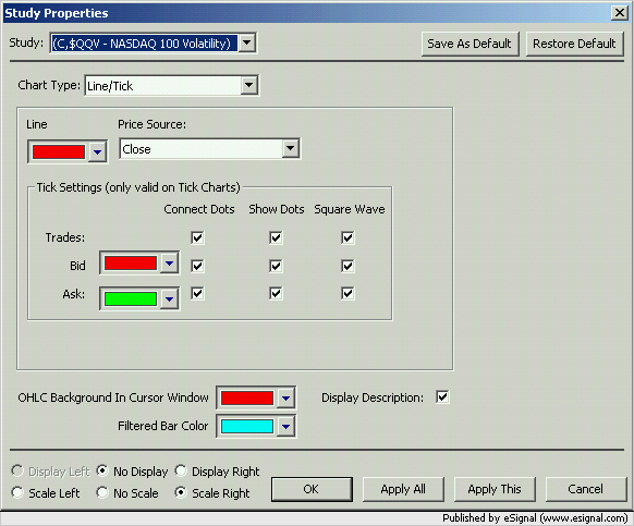
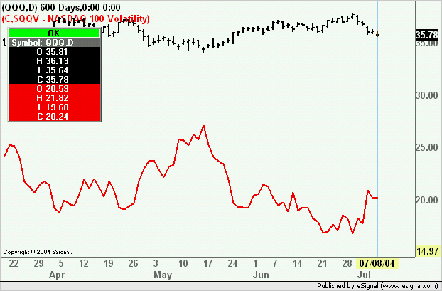
    I just stumbled upon a way to recreate the "Flow" chart type in the Advanced Charts that was only in the Standard Chart before.

    1) Pull up the symbol in a Line Chart.
    2) Set the Line Chart to be drawn using the High as the source.
    3) Add the same symbol as an overlay
    4) Change the overlaid symbol's chart type to Line, and use Low as the source.

    Using this method, won't be an exact replica, but it provides the same shape.
    Attached Files
    Regards,
    Jay F.
    Product Manager
    _____________________________________
    Have a suggestion to improve our products?
    Click Support --> Request a Feature in eSignal 11

  • #2
    How do you add an overlay onto an existing chart?

    Thanks

    Comment


    • #3
      Hi alui,

      One way to do this is from within the existing chart, hit the "," key which will bring up the Change Symbol dialog box. Note, this removes the interval that was presently display, you'll need to re-enter the interval. At bottom left of dialog box is a button with the title, "Multiple Symbols >>". Click on that and a drop down box will appear. You're given an additional 4 fields for which you can enter symbols for an overlay.

      Let us know if this is not what you're looking for.

      Thanks,

      Comment


      • #4
        Yep, worked; exactly what I'm looking for.

        Thanks

        Comment


        • #5
          I was also trying to figure out how to do this, as the built in help is totally wrong about using the Overlay function.

          My problem now is that I'm trying to overlay QQQ and $QQV, but because it maintains some kind of relative scaling, as I scroll around on the chart the distance between the two changes dramatically! Since I'm looking for extremes between the two, having those extremes get wider or narrow as I move around on the chart is a Very Bad Thing.

          Any idea how to get around this?

          Thanks!

          J

          Comment


          • #6
            Jonathan
            If you want the scales to be fixed set up the scale for the overlayed symbol as in the following image


            The result will be as shown in the next image.
            As to the relative scaling while that may be unnecessary in the case of these two symbols it is actually very useful when the prices of the overlayed symbol(s) differ by a considerable amount from those of the primary symbol else you would end up with compressed and unusable plots
            Alex

            Comment


            • #7
              Thanks Alex. You are of course correct about the usefuleness of the overlay feature. I just needed to know how to make it work the way I wanted in my particular case. Thanks again!

              J

              Comment

              Working...
              X